

~ DESTROYING IMAGES ~
- s45489318
- Sep 30, 2021
- 7 min read
Updated: Oct 23, 2021
MIND MAP

ARTIST RESEARCH 1
Raoul Hausmann

Known for his inventive photomontages, collages, and photographs, Raoul Hausmann was an Austrian artist whose work and writings contributed significantly to the Berlin Dada group's discourse in the 1920s. Born July 12, Vienna, Austria, 1886, Raoul's father, a portrait and history painter exposed him to art at a young age. Eight years after he and his family moved to Berlin, Raoul worked for the studio of Arthur Lewin-Funcke. He met Richard Huelsenbeck in 1917, who exposed him to the tenets of Dada after mainly producing works in the artistic idiom of German Expressionism. Raoul wrote various essays in the years that followed and exhibited his work alongside his partner Hannah Hoch including George Grosz andJohn Heartfield. He devoted most of what was left of his career to publishing writings about Dadaiam after World War II. On February 1, 1971, Raoul died in Limoges, France. The Museum of Modern Art in New York, the National Gallery of Art in Washington, D.C., holds artists' works today.

This photomontage shows a mixture of faces, machines, letters and word elements in the frame. Though the image doesn't have a clear meaning, the colours are complementary and help tie the picture together.
Raoul Hausmann mainly uses these random mixtures in his photomontages, and he destroys the language, taking away the meaning. Since Raoul did these montages for the rest of his profession, I think this image was made between 1910 and 1940.
This defiantly gives me another view of my assignment. It is an excellent example of bringing the viewers in, even though it doesn't precisely mean something.
I really like that he breaks and combines different words and letters specifically. By taking away the meaning, the viewers then take an interest in how the image is formed.
MOOD BOARD 1

ARTIST RESEARCH 2
Rosanna Jones

My chosen artist for this part of the assignment is Rosanna Jones. Jones is a mixed media maker and photographer who graduated from Falmouth University in Fashion Photography. Based in London, her work is an experimental mix of art and photography that celebrates an image's physical possibilities rather than just its two-dimensional appearance. Throughout the years, her signature aesthetic of painting over, tearing up, burning and often damaging her photography has evolved into tactile portraits that contradict the flat pictures they originally were.
Growing up in a home that encouraged artistic expression, creating with her hands has always been Jones's passion. She found photography when she was 14 and began combining her two interests, visual and manual creation. Her potential to mirror herself in her work today, even when it is hard, has led her to produce unique art and build a fashion and music industry profession.
Jones commemorates texture, shape and form while combining and blending art, photography and illustration into a single piece, without doubt, mixing multiple techniques (visual, digital and manual techniques).
"I love apart; reconstructing them, changing them up to create something that is part confusing, part satisfying," Jones says.

This photograph is a close-up portrait collage of a young lady.
The model's face fills the frame, but your eyes are drawn to the area cut and filled with another media. The juxtaposition of the collaged parts and the model's natural skin work well together and stand apart.
Rosanna Jones is known for mixing different techniques to give her images a new form. This image was part of a project she was doing and completed in recent years (2017-2020). From the photo's texture, it looks like three different pictures were used and layered on top of each to create this new, more exciting photo.
I would like to take inspiration from this image. It is different to what I usually do, but for this assignment, it is something I would love to try. I want to try and balance contrasting textures while shining a light on those features.
I really like this image. It's interesting to see artists combine the many skills they have to elevate their work. I also think that her use of just warm colours also helped immensely with this image.

This image shows a portrait photomontage of a girl.
The same photo scattered on top of the image causes the viewer's eyes to move around the frame and really take in the picture. The colours also work well together (mainly because it was just warm colours used).
The photo was most likely taken in a studio, printed out multiple times and reconstructed by Rosanna Jones. It could have also been created as early as 2017 to 2020, and her redeveloping the image makes it far more interesting than if it were felt the way it was.
I also want to learn from this image because I am very precise with constructing montages. I want to try and not be so restraining and just go with the flow. This image is an excellent example that not everything has to be placed perfectly for the image to look attractive.
I really like that the image also gives the viewer freedom to interpret. For me, the photo looks like a broken mirror and could represent the model trying to find herself or fighting her true
self. There could be many meanings, each being unique to the viewer.
MOOD BOARD 2

IMAGE MAKING PROCESS
(To look closer at the images, click on them and to exit click the X in the top right hand corner or the Esc button on your keyboard)
Image 1:

Step 1: I sketched and painted flowers in black and white on a metallic red card.
Step 2: I then printed my image in colour, carefully cut it out with a pair of scissors and a stanley knife and stuck it on the card.
Step 3: I printed the same image in black and white, cut triangle shapes out of it, and lined them up on the coloured photo.
Step 4: Once the shapes are aligned, I stuck them down and finished the piece.


Image 2:

Step 1: I used blue, grey and white paint to paint on a white sheet of card. I painted two grey triangle-like shapes with blue and darker grey strokes in them.
Step 2: I printed and cut the first image with a pair of scissors and a stanley knife and burnt where the outline of the dress was.
Step 3: I printed the second image and separated the face from the sleeve of the dress. I aligned the first image on top of the face and ensured that the eyes were seen. I did this by making a slit around the right eye and placing it over the arm.
Step 4: I burnt the dress sleeve, put both images together, and stuck them on the card.
Step 5: I also printed out blue flowers and a flame crown, and I stuck the flowers around the sleeve and the crown around the colour head.


Image 3:

Step 1: After opening the image into photoshop, I added a new layer and clicked the selection tool (after clicking the background), and only selected the black spots on the pink building.
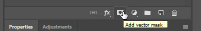
Step 2: When all areas are selected, I click on Layer 1 (the Layer added) and click the Add A Mask icon to add a layer mask.
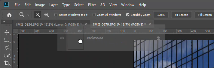
Step 3: I then opened a new image in photoshop and dragged and dropped it into the edited image. I resized and moved the photo where I wanted and moved the layer mask on Layer 1 next to the picture just dragged and dropped.


NOTE: You can't resize the image after the mask is added because we want it to align with the original photo. This is why the empty Layer is there to move that layer mask freely.
Step 4: I clicked the background and selection tool and selected the sky. Then I clicked Layer 1 and Add A Mask.
Step 5: I opened the following image I wanted to use into Photoshop, dragged and dropped it into the edited image, and moved it above all of the layers so far.
Step 6: I resized and moved the image how I liked and moved the layer mask on Layer 1 onto that image. Because I wanted it to look like the building was in the distance, I clicked the arrow next to " Normal " under the Layer section and moved down to " Screen ".


Step 7: I opened the following image into photoshop.
NOTE: Because I only wanted to use specific buildings in the image, I used the selection tool, selected those buildings, copy and pasted them to create a separate layer for them, and dragged and dropped them into the main image.


Step 8: I moved and resized the image and right-click on the Layer Mask for the sky. I also wanted these buildings to look like they were in the distance, but I lowered the opacity.
Step 9: It was easier to change everything I edited into black and white; I merged all the layers.
NOTE: To merge the layers, click on one Layer, hold the shift key and click on all others. Then right-click and go down to merge layers.
Step 10: Click Image, Adjustments and Black and White. I then adjusted the colours since I wanted something to be lighter and others to be darker.


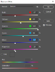
Image 4: Additional Image

EVALUTION OF TASK
There was no specific theme for this task, but the topic was destroying images. This is a method to create montages and photomontages using multiple images with or without other mediums (e.g. paints, markers, etc.). By using paint, glue and photoshop, I created three images.
I reached two artists, Raoul Hausmann and Rosanna Jones. Both have two different art styles and shows how broad this kind of imagery is. I mainly took inspiration from Rosanna since the more recent images I took were fashion and portrait photos. Using that inspiration helped me succeed in creating interesting pieces.
The process for this assignment went very smoothly. Though I did use photoshop, I only required the basic skills and didn't encounter any problems. The results were great, and I wouldn't change anything I did.
Websites Used:
Comments